
I have a vector age that contains the ages in years for these pitchers.
A histogram is a standard way of graphing this data. Before I graph, I should select reasonable bins; I could use the default selection of bins chosed by the R hist command, but I typically like more control over my graphical displays.
Here I'm interested in the number of players who are each possible age 20, 21, 22, ... etc. So choose cutpoints 19.5, 20.5, ..., 46.5 that cover
the range of the data and so there will be no confusion about data falling on bin boundaries.
cutpoints=seq(19.5,46.5)
Now I can use the hist function using the optional breaks argument.
hist(age,breaks=cutpoints)
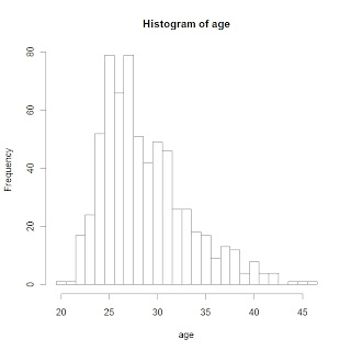
What do I see in this display?
- The shape of the data looks a bit right-skewed. I'm a little surprised about the number of pitchers who are 40 or older.
- The most popular ages are 25 and 27 among MLB pitchers.
- Looking more carefully, it might seem a little odd that we have 79 pitchers of ages 25 and 27, but only 66 pitchers who are age 26.
What is causing this odd behavior in the frequencies for popular ages? We don't see this behavior for the bins with small counts.
Actually, this "odd behavior" is just an implication of the basic EDA idea that
LARGE COUNTS HAVE LARGER VARIABILITY THAN SMALL COUNTS
So we typically will see this type of behavior whenever we construct a histogram.
When we plot a histogram, it would seem desirable to remove this "variability problem" so it is easier to make comparisons. For example, when we compare the counts to expected counts assuming a Gaussian model, it will be harder to look at residuals for bins with large counts and bins with small counts since we will have this unequal variability problem.
This discussion motivates the construction of a rootogram and eventually a suspended rootogram to make comparisons with a symmetric curve.
By the way, can we fit a Gaussian curve to our histogram? On R, we
- first plot the histogram using the freq=FALSE option -- the vertical scale will be DENSITY rather than COUNTS
- use the curve command to add a normal curve where the mean and standard deviation are found by the mean and sd of the ages
Here are the commands and the resulting graph.
hist(age,breaks=cutpoints,freq=FALSE)
curve(dnorm(x,mean(age),sd(age)),add=TRUE,col="red",lwd=3)
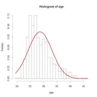
It should be clear that a Gaussian curve is not a good model for baseball ages.
No comments:
Post a Comment