Monday, December 1, 2008

Why do we flog?

I just put an example of using flogs to compare scores on two years of placement scores.  But some of you may be confused why we take flogs in the first place.  Here are the main points.

1.  We want to compare two proportions, say p1 and p2.  There are two problems with a direct comparision like p1/p2.

a)  This measure depends on whether we consider the proportions p1, p2 or the proportions 1-p1, 1-p2, and that's a problem.  The choice of p1, p2 or 1-p1, 1-p2 shouldn't change our comparision.

b)  Small proportions tend to have smaller variation than large proportions (close to .5).  The ratio p1/p2 = 1.5 is more meaningful (significant) if the p's are close to zero, than if the p's are close to 0.5.

So we want to transform a proportion p so that 

-- it doesn't matter if we consider p or 1-p
-- the variance of the transformed p will be roughly the same for p near 0 and p near 0.5.

By using the flog reexpression log(p/(1-p)) we achieve these two goals.

By the way, the flog reexpression is the basis for logistic regression models.  You will likely be using logistic regression in your statistical life, but we are trying here to motivate why we use the flog reexpression.


Flogging placement data

Here's an illustration on transforming data for proportion data.

Every summer, a math placement test is given to over 3000 entering freshmen.  The score on this test is used to determine which math course they are allowed to take in the fall.

The score on the placement test is a course number that indicates that the student can take that course in the fall.  Here are the counts of the placement scores for the freshmen in the last six years:

     2003 2004 2005 2006 2007 2008
131H   33   54   51   57   44   41
131   196  364  342  361  320  251
130   192  245  236  248  211  208
128   557  707  647  700  603  618
126   428  518  489  480  442  428
122   501  612  580  565  464  498
215   661  912  888  838  792  747
112   207  216  230  208  212  180
095   418  524  545  419  407  335
090    46   78   89   58   62   46

How can we compare the scores for different years?  A first step to compute percentages of each column.

     2003 2004 2005 2006 2007 2008
131H  1.0  1.3  1.2  1.4  1.2  1.2
131   6.1  8.6  8.3  9.2  9.0  7.5
130   5.9  5.8  5.8  6.3  5.9  6.2
128  17.2 16.7 15.8 17.8 17.0 18.4
126  13.2 12.2 11.9 12.2 12.4 12.8
122  15.5 14.5 14.2 14.4 13.0 14.9
215  20.4 21.6 21.7 21.3 22.3 22.3
112   6.4  5.1  5.6  5.3  6.0  5.4
095  12.9 12.4 13.3 10.7 11.4 10.0
090   1.4  1.8  2.2  1.5  1.7  1.4

We see in 2003 that 6.1% of the students placed in MATH 131 and 20.4% placed in MATH 215.

Let's follow Tukey's strategy for comparing percentage vectors.  To make this simple to explain, let's focus on comparing the percentages of 2006 and 2007.

     2006 2007
131H  1.4  1.2
131   9.2  9.0
130   6.3  5.9
128  17.8 17.0
126  12.2 12.4
122  14.4 13.0
215  21.3 22.3
112   5.3  6.0
095  10.7 11.4
090   1.5  1.7

1.  First we cut the data by some row.  Let's try cutting the data after the second row.

     2006 2007
131H  1.4  1.2
131   9.2  9.0
---------------
130   6.3  5.9
128  17.8 17.0
126  12.2 12.4
122  14.4 13.0
215  21.3 22.3
112   5.3  6.0
095  10.7 11.4
090   1.5  1.7

2.  We compute a folded log for each year.  For 2006, we see that 1.4 + 9.2 = 10.6% are above the line and 100 - 10.6 = 89.4% are below the line, so the flog is

FLOG for 2006 = log(10.6/89.4) = -2.13

Likewise the flog for 2007 is given by

FLOG for 2007 = log(10.2/89.8) = -2.18

3.  To compare the years 2006 and 2007, we look at the difference in flogs:

Change in FLOG from 2006 to 2007 is -2.18 - (-2.13) = -0.05

The interpretation is that students did 0.05 worse in 2007 (on the flog scale).

What if we cut the table by a different row?  We can repeat the procedure using all possible cuts.

Here is the table of flogs:

       2006  2007
 [1,] -4.22 -4.38
 [2,] -2.13 -2.17
 [3,] -1.59 -1.65
 [4,] -0.63 -0.70
 [5,] -0.12 -0.18
 [6,]  0.46  0.35
 [7,]  1.56  1.44
 [8,]  1.98  1.88
 [9,]  4.20  4.03

To understand these values, -4.22 is the flog if we cut after the first row, -2.13 is the flog if we cut after the second row, etc.

To compare the years 2006 and 2007, we look at the difference in flogs:

     2007 FLOG - 2006 FLOG
 [1,] -0.16
 [2,] -0.04
 [3,] -0.06
 [4,] -0.07
 [5,] -0.06
 [6,] -0.11
 [7,] -0.12
 [8,] -0.10
 [9,] -0.17

What have we learned?  Note that all of the flog differences are negative and the median flog difference is -0.10.  So it is clear the 2007 students did a little worse than the 2006 students.


Friday, November 21, 2008

Binning homework

Some of you appear to be confused on this "binning" homework.  Let's outline what you are supposed to do in this assignment.

1.  First you bin your data and construct a histogram.  This is easy (I hope).  The histogram gives you counts of each bin.

By the way, a rootogram is just like a histogram, but you are graphing the root counts against the bins.  (Why do you do this?  Look at the notes.)

2.  You find a Gaussian curve that fits your data -- you have a mean and a standard deviation.

3.  Now you want to find the expected or fitted counts from the Gaussian curve.  You do this by running the function fit.gaussian -- the inputs to this function are your bins, the vector of raw data, and the mean and standard deviation of the Gaussian curve.   Suppose you save the output of this function into the variable s.  Then

s$counts are the observed bin counts
s$expected are the expected counts

4.  The question at this point is -- does the Gaussian curve provide a good fit to the histogram?  Well, maybe yes, and maybe no.

How can you tell?

You look at the residuals which are essentially the deviations of the counts from the expected counts.

I defined several residuals in the notes.

Simple rootogram residuals are 

r.simple = sqrt(d) - sqrt(e)

These are graphed by use of the rootogram function.

The double root residuals are defined by

DRR = sqrt(2+4d) - sqrt(1+4e).

How do I compute these?  Well, you already have computed the d's and the e's -- you can use R to compute the DRR's.

5.  Once I compute the residuals and graphed them, am I done?  Well, the point of graphing the residuals is to see if they show any systematic pattern -- if there is a pattern, then the Gaussian curve is not good.

6.  Well, we are almost done.  Part 1 (d) asks you to fit a G comparison curve to the root data.  (Boy, your instructor seems to like taking roots.)

All I'm asking here is to FIRST transform the data by a root, and then repeat all of the above with the root data.

7.  Lastly, in #2, I'm asking you to fit a G curve to the women heights.  If you have loaded in the studentdata dataset, then to get the female heights, you type

library(LearnEDA)
data(studentdata)
f.heights=studentdata$Height[studentdata$Gender=="female"]

Good luck!


Tuesday, November 18, 2008

Learning about Lengths of Baseball Games

One complaint about baseball is that it is a relatively long game, compared to American football or basketball.

To understand more about the lengths of baseball games, I collected the lengths (in minutes) of all games played during the 2007 season.  Here are my questions:

1.  Are the times of baseball games normally distributed?
2.  If not, how do the times differ from a normal curve?

I'll illustrate the R work. You'll need a couple of packages: LearnEDA and vcd (for the rootogram function).

1.  First I'll read in the baseball game times, construct bins and the rootogram (this is essentially a histogram where you plot the roots of the counts instead of the counts).

library(LearnEDA)
data=read.table("game.time.07.txt",header=T)
attach(data)

# set up bins and construct a rootogram

bins=seq(100,300,by=20)
bin.mids=(bins[-1]+bins[-length(bins)])/2
h=hist(time,breaks=bins)

h$counts=sqrt(h$counts)
plot(h,xlab="TIME",ylab="ROOT FREQUENCY",main="")


2.  Now I want to fit a normal comparison curve.  I figure out the mean and standard deviation of the normal curve by using letter values.

# find mean and standard deviation of matching Gaussian curve

S=lval(time)
f=as.vector(S[2,2:3])
m=as.integer((f[1]+f[2])/2)
sd=as.integer((f[2]-f[1])/1.349)

I get that the times are approximately N(175, 24).

3.  Is this normal approximation ok?  The function fit.gaussian computes the expected counts for each bins and computes the residuals sqrt(observed) - sqrt(expected).

# function fit.gaussian.R fits Gaussian curve to the counts

s=fit.gaussian(time,bins,m,sd)

# output observed and expected counts

output=round(data.frame(s$counts, sqrt(s$counts), s$probs, s$expected, 
     sqrt(s$expected), sqrt(s$counts)-sqrt(s$expected)),2)
names(output)=c("count","root","prob","fit","root fit","residual")
output

   count root prob   fit root fit residual
1      1 1.00 0.01  1.00     1.00     0.00
2      8 2.83 0.06  6.08     2.47     0.36
3     22 4.69 0.19 19.17     4.38     0.31
4     27 5.20 0.32 31.34     5.60    -0.40
5     20 4.47 0.27 26.60     5.16    -0.69
6     12 3.46 0.12 11.72     3.42     0.04
7      6 2.45 0.03  2.67     1.64     0.81
8      1 1.00 0.00  0.32     0.56     0.44
9      1 1.00 0.00  0.02     0.14     0.86
10     1 1.00 0.00  0.00     0.02     0.98


# place root expected counts on top of rootogram

lines(bin.mids,sqrt(s$expected),lwd=4,col="red")


3.  The rootogram function plots the residuals.  Both plots below show the same info, but in different ways.

# load library vcd that contains rootogram function

library(vcd)

# again save histogram object

h=hist(time,breaks=bins,plot=F)

# illustrate "hanging" style of rootogram

r=rootogram(h$counts,s$expected,type="hanging")  # this is the hanging style 


# illustrate "deviation" style of rootogram

r=rootogram(h$counts,s$expected,type="deviation") 


What have we learned?  Although the lengths of baseball games are roughly normal in shape, we see that there are some large negative residuals on the right tail.

What does this mean?  Baseball game lengths have a long right-tail which means one tends to see many long games.  If you know anything about baseball, you know that baseball can go into extra-innings when there the game is tied after 9 innings, and these extra-inning games cause the long right tail.

Sunday, November 9, 2008

Median Polishing Student Grades


Our department recently was interested in exploring the relationship between student class attendance and performance in a number of 100-level math classes.   We all know that missing math classes will have an adverse effect on grades, but we wanted to learn more about this relationship.

For many students in four 100-level math classes, we collected the student's attendance (percentage of classes attended) and their performance (a percentage where a 90% corresponds to A work, 80-90% a B, etc).   We decided to categorize attendance using the categories 0-50%, 50-70%, 70-90%, over 90%) and then we found the mean performance for students in each categorization of attendance and course.  We got the following two-way table.

          Attendance Pct
COURSE   0-50 50-70 70-90 90-100  
---------------------------------       
MATH 112  61.9  68.0  68.8  75.5
MATH 115  54.3  71.8  76.6  83.3
MATH 122  56.1  64.8  73.1  78.1
MATH 126  50.6  66.3  73.9  78.1

I'll demonstrate median polish with this data.

1.  First, I have to get this data into a matrix form into R.  I'll first use the matrix command to form the matrix (by default, one enters data column by column) and then I'll add row and column labels.

grade=matrix(c(61.9,54.3,56.1,50.6,
               68.0,71.8,64.8,66.3,
               68.8,76.6,73.1,73.9,
               75.5,83.3,78.1,78.1),c(4,4))

dimnames(grade)=list(c("MATH 112","MATH 115","MATH 122","MATH 126"),
                     c("0-50","50-70","70-90","90-100"))

To check that I've read in the data correctly, I'll display "grade":

> grade
         0-50 50-70 70-90 90-100
MATH 112 61.9  68.0  68.8   75.5
MATH 115 54.3  71.8  76.6   83.3
MATH 122 56.1  64.8  73.1   78.1
MATH 126 50.6  66.3  73.9   78.1

2.  Now I can implement median polish to get an additive fit.  I'll store the output in the variable "my.fit" and then I'll display the different components.

> my.fit=medpolish(grade)

Here's the common value.

> my.fit$overall
[1] 69.7

Here are the row effects.

> my.fit$row
MATH 112 MATH 115 MATH 122 MATH 126 
 -0.7375   4.5000   0.2875  -0.2875 

Here are the column effects.

> my.fit$col
     0-50     50-70     70-90    90-100 
-16.35000  -2.75625   2.75625   8.40000 

I'll interpret this additive fit.

  • The average performance of these students is 69.7%.

  • Looking at the row effects, we see that MATH 115 students get grades that are 4.5 - (0.2875) approx 4.2 points higher than MATH 122 students.  MATH 122 students tend to be 0.2875 - (-0.2875) approx 0.57 points higher than MATH 126 students, and MATH 112 students are about a half percentage point lower than MATH 126 students.

  • Looking at the column effects, we see a clear relationship between attendance and performance.  The best (90-100%) attenders do 8.4 - 2.75 = 5.65 points better (on average) than the 70-90 attendance group, do 8.4 - (-2.75) = 11.15 points better than the 50-70 attendance group, and a whopping 8.4 - (-16.35) = 24.75 points better than the "no shows" (the under 50% attending group).
3.  It might be helpful to plot this fit.  I wrote a function plot2way in the LearnEDA package:

> library(LearnEDA)
> plot2way(my.fit$overall+my.fit$row,my.fit$col,dimnames(grade)[[1]],
  dimnames(grade)[[2]])

Note that the plot2way function has four arguments:  the row part, the column part, the vector of names of the rows, and the vector of names of the columns.  Here's the figure.


Actually, this plot would look better if I had figured out how to rotate the figure so that the FIT lines are horizontal.  (I'll give extra credit points to anyone who can fix my function to do that.)

From this graph we see that the best performances are the MATH 115 students who attend over 90% of the classes; the worst performances are the MATH 112 students who have under 50% attendance.

4.  Are we done?  Not quite.  We have looked at the fit, but have not looked at the residuals -- the differences between the performance and the fit.  They are stored in my.fit$residual -- I will round the values so they are easier to view.

> round(my.fit$residual)
         0-50 50-70 70-90 90-100
MATH 112    9     2    -3     -2
MATH 115   -4     0     0      1
MATH 122    2    -2     0      0
MATH 126   -2     0     2      0

I see one large residual that I have highlighted in red.  MATH 112 students who don't come to class (under 50% attendance) seem to do 9 points better than one would expect based on the additive fit.   This might deserve further study.


Thursday, October 30, 2008

My Smoothing Tribute to the Phillies


Last night was an exciting night.  My team, the Philadelphia Phillies, won the World Series for only the second time in their history that started in 1883.

So it seems appropriate to give a statistical tribute to the Phillies.

I collected the Phillies winning percentage (percentage of games won) for each season in their history.  Below I plot the winning percentage against the season year.


It is hard to see the general pattern in this graph, so it makes sense to smooth.  I could use Tukey's resistant smooth described in the EDA notes, but I'll illustrate the use of an alternative smoothing method called lowess.  Here is the R code to graph the scatterplot and overlay the lowess smooth.

plot(Year,Win.Pct,pch=19,col="red")
lines(lowess(Year,Win.Pct,f=.2),lwd=3,col="red")
title("PHILLIES WINNING PERCENTAGES",col="red")
abline(h=50,lwd=2)


I added the horizontal line at WIN.PCT = 50 that corresponds to an average season.

Looking at the graph, you should see why the Philadelphia fans are so excited about the Phillies winning this season.

1.  The Phillies teams generally have been crummy, especially between 1920 and 1950.  The team hasn't experienced much success.

2.  But there have been two recent periods where the Phillies have been successful.  One period was in the 1970's and the climax of this success was the Phillies first World Series win in 1980.  The second period is in recent history and of course the Phillies won their second World Series in 2008.


Sunday, October 26, 2008

Comments on Plotting Homework

Here are some general and specific comments on your efforts on Homework 4 on plotting and straightening.

First, most of you did well on this homework.  You were good in describing the fit and the pattern in the residuals.  Also you made reasonable choices at reexpressing the x and/or the y variable so that the graph looked pretty straight.

But there were some things that caused you to lose points.

1.  What are you looking for in a residual plot?  In this assignment, the focus was looking for nonlinear patterns.    For example, is it appropriate to fit a line to the (year, population) data for the England and Wales dataset?  We can answer this question by looking for a nonlinear pattern in the plot of residuals against year.  There is significant curvature (that is, a quadratic pattern) in the residual plot which tells you that the population growth is not linear.

By the way, some of you plotted log population against log year -- why did you take the log of year?  It doesn't make any sense to me.  

2.  Always talk about the fit and the residuals in the context of the data.  Someone plotted x against y without telling me the variables.  The fun part of statistics is that you can always talk about the application.

3.  Remember that funny problem where the scatterplot shows two group of points with a clear separation?  This is one type of nonlinear pattern that you won't be able to straighten with a single choice of power transformation.  But since the graph clearly divides into two parts, it makes sense to treat this as two independent problems and try to straighten each part.

4.  Should one fit a line by least-squares or by a resistant line?  In many situations, it won't make a difference -- either fit will work.  But least-squares can give you relatively poor fits when there are outliers.  

How can you tell if least squares isn't the best fit?  Look at the residual plot.  If you still see some increasing or descreasing pattern, then this tells you that least-squares hasn't explained all of the "tilt" pattern in the graph.

Monday, October 20, 2008

Straightening

This week, the main topic is reexpressing either the x or y variable to straighten a nonlinear pattern that we see in a scatterplot. Although the manipulation may be straightforward, it is possible to miss the main message in this material. Here are some questions that may help in your explanations in the homework.

Question 1: What is a simple description of the pattern in a scatterplot?

Question 2: Why do we prefer to fit lines instead of more complicated curves like quadratic or cubic?

Question 3: Is it possible to straighten all nonlinear patterns by power transformations?

Question 4: Can you think of a situation or an example where it is not possible to straighten by power transformations?

Don't forget to look at your data first -- you may see rightaway that it is not possible to straighten the graph.

Wednesday, October 15, 2008

Example of Resistant Fitting

In baseball, the objective is to win games and a team wins a game by scoring more runs than its opponent. An interesting question is "how important is a single run" towards the goal of winning a game? Suppose one collects the runs scored, the runs allowed, the number of wins and the number of losses for a group of teams. Bill James (a famous guy who works on baseball data) discovered the empirical relationship

log(wins/losses) = 2 log(runs scored/runs allowed)

He called this the Pythagorean Relationship.

Let's try to demonstrate this relationship by use of a resistant fit.

1. First, I collected data for all baseball teams in the 2008 season. The dataset teams2008. txt contains for each of the 30 teams ...

Team -- the name of the team
Wins -- the number of wins
Losses -- the number of losses
Runs.Scored -- the total number of runs scored
Runs.Allowed -- the total number of runs allowed

2. I read this dataset into R and compute the variables log.RR and log.WL.

data=read.table("http://bayes.bgsu.edu/eda/data/teams2008.txt",header=T)
attach(data)

log.RR=log(Runs.Scored/Runs.Allowed)
log.WL=log(Wins/Losses)

3. I graph log.RR against log.WL and add team labels to the graph. As we hoped, the relationship looks pretty linear.

plot(log.RR,log.WL,pch=19)
text(log.RR,log.WL,Team,pos=2)


4. I next fit a resistant line using the rline function in the LearnEDA package. I add the
fitted line to the graph.

the.fit=rline(log.RR,log.WL,iter=4)
curve(the.fit$a+the.fit$b*(x-the.fit$xC),add=TRUE)

5. If Bill James' relationship holds, the slope of the resistant line should be close to 2.

the.fit
$a
[1] 0.01006079
$b
[1] 1.801718

It approximately holds since the slope of 1.8 is close to 2.

6. To see if this is a reasonable fit, we compute the fit and the residuals.

FIT=the.fit$a+the.fit$b*(log.RR-the.fit$xC)
RESIDUAL=log.WL-FIT

and then plot the residuals, adding the team labels.

plot(log.RR,RESIDUAL,pch=19)
abline(h=0)
text(log.RR,RESIDUAL,Team,pos=2)


7. What are we looking for in the residual plot? First, we look for general patterns that we didn't see earlier in the first plot. I don't see any trend, so it appears that we removed the tilt by fitting a line.

Also we are looking for unusually small or large residual. Here a "lucky team" corresponds to a team who seemed to win more games than one would expect based on their wins and losses.

Which team was unusually lucky in the 2008 season? A hint: they were a "heavenly" team from the west coast.

Monday, October 6, 2008

Reexpressing for Symmetry


Your instructor is currently in "Phillies Heaven".  His baseball team rarely has a chance to win the World Series (they have won one World Series in over 120 seasons of competing) and they currently in the National League Championship against the Dodgers!

Oh right -- I'm supposed to talk about the EDA class.

I finished the grading on your "symmetry" homework and Fathom assignment.    You generally did fine, but I'll explain some issues that may have caused you to lose points.

What was I looking for?

In the notes, we talked about several methods for assessing symmetry of a batch, including looking a the sequence of midsummaries, using a symmetry plot, and Hinkley's quick method.   For each dataset you consider, here's a outline of what you should do:

1.  Demonstrate (using some method) that your raw data looks nonsymmetric.

2.  Experiment with power transformations with different choices of p to try to make the reexpressed data approximately symmetric.  Use one of our methods to see if the "p-reexpression" works.

3.  Convince me that you have found a reasonable transformation by graphing the reexpressed data (say by a histogram or a stemplot).

It is best if you explain (with words) your process of finding the best reexpression.  I'm much more interested in your thought process than your computer output.

Here are a few other pitfalls.

1.  Some of you were confused when you considered reexpressions with negative values of p.

p = 1  -- data is really right-skewed (big positive value of Hinkley's d)

p = 0 -- data is slightly right-skewed (smaller positive value of d)

p = -1 -- data is right skewed (positive value of d)

What is going on?  The problem is that you were defining a reexpression like p = -1/2 as

data^(-1/2)

when you should have used

-data^(-1/2)

By adding the negative sign, all of your transformations are increasing functions, and then
you can make better sense of the reexpressed graphs and the methods.

2.  Reexpression only works when there is sufficient spread in your data.  Suppose you have data that ranges from 50 to 60 -- here the range is only 60/50 = 1.2.  Reexpression using any value of p won't work -- that is, it won't change the shape of the data.

3.  One of you used a normal probability plot to determine if the graph was symmetric.  What's wrong with this?  Well, it is not one of the methods we discussed in the notes.  Second, checking for normality is different (but related) than checking for symmetry.  Data can be symmetric but not normally distributed.


Monday, September 29, 2008

Did reexpression work?

I finished grading your Fathom spread vs level plot assignment.  I've posted all of the grades on Blackboard.

When I grade your homework, I'm more interested in your explanation and comments rather than the mechanics.  This homework is a good illustration of this.

You started by constructing a spread vs level plot of the weights by the supplements.  Here's the graph produced by the spread.level.plot function in the LearnEDA package.


Here are the main questions:

1.  Is there a dependence between spread and level?  

Yes, but the pattern in the graph is a bit confused with the outlying point in the lower-right section of the plot.  If we removed this point, there would appear to be a stronger relationship.

2.  Can we improve by a suitable reexpression?

There is a line of slope 0.18 drawn on the graph.  This would suggest the use of a power transformation with power p = 1 - 0.18 = 0.82.  

3.  Is this a reasonable strategy?

If we transform by a 0.82 power, this won't really change things.  It is almost equivalant to taking a 1 power which is no change.  

But looking more carefully at the graph, we would fit a different line if we ignored that one outlier.  Then one would get a line with a smaller slope, like 0.50 and this would suggest the use of a root transformation.  This would really be nontrivial and would help the general dependence between spread and level.

If you made some comments that were similar in spirt to the ones I've made above, then you got full credit.  You could have lost points if you went through the mechanics without commenting on what you actually did.

Tuesday, September 23, 2008

Missing the Forest for the Trees

I just completed grading your "comparison" homework and have posted the grades.

There is a figure of speech called "missing the forest for the trees." This means that one can get caught up in the details of a problem without really understanding the real issues that are involved.

An example of "missing the forest for the trees" is your homework.
  • Why do we reexpress data?
We reexpress to equalize the spreads between batches.
  • But why do we care about equalizing spreads?
We care about equalizing spreads since we wish to make a simple comparison between batches.
  • What is a simple comparison?
A simple comparison is saying that one batch is, say, 5 units large than another batch.

If you don't conclude your analysis with a simple comparison, then all of your work (finding 5-number summaries, constructing a spread vs level plot, reexpressing, etc) is for NOTHING.

In other words, MAKING A USEFUL INTERPRETATION (in this case, a useful comparison) is EVERYTHING.

A few of you were successful in making simple comparisons in your homework and I congratulate you if you got a 30/30 on the comparing batches homework.

Remember, don't forget to look for the forest.

A Exploratory Data Analysis Story

When I was grading your homework this week, I thought of this story.

--------------------------------------------------------------------------

One day, a boy was interested in taking a course in exploratory data analysis, but he didn't have the money to pay for it. He decided on asking his grandmother for the money for the course. She decided to help, but she said "I hope this is a worthwhile class for you."

Anyway, the boy visited his grandmother recently and told her that the course was going well. The grandmother asked what he was learning and the boy responded:

Last week, we learned how to compare groups of data. We compared the yearly snowfall of Buffalo with Cairo. It was hard to compare the two groups since there was a dependence between level and spread that I learned by constructing a spread versus level graph. But this graph suggested the use of a p = 0.5 power transformation and when I did a spread versus level graph of the transformed data, the dependence between spread and level was reduced.

The grandmother, listening intently, responded "So what did you conclude from your data analysis?"

The boy said proudly "There is more snow in Buffalo than Cairo."

The grandmother then with a heavy sigh said "Can we get our money back?"

------------------------------------------------------------------------

What is the message in this story? (It relates to the work that you did on your homework.)

Wednesday, September 17, 2008

Boxplots in R

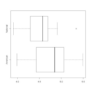
Here is a simple example of constructing boxplots and summary stats in R.

I'm interested in comparing the team statistics for baseball teams this year -- I've heard
that American League teams score more runs. Is that true?

Using data from baseball-reference.com, I created a dataset 2008teamstats.txt that contains current statistics for all 30 baseball teams.

Here's my R script. I'll paste in a horizontal-style boxplot display at the end.

> b.data=read.table("http://bayes.bgsu.edu/eda/data/2008teamstats.txt",header=T)
> b.data[1:5,1:5]
Tm League R.G R G
1 TEX American 5.49 835 152
2 BOS American 5.29 799 151
3 MIN American 5.16 779 151
4 DET American 5.06 759 150
5 BAL American 5.03 750 149
> # I am interested in comparing the runs scored per game
> # (variable R.G) for the American and National league teams
>
> attach(b.data)
>
> # Here are the boxplots:
>
> boxplot(R.G~League)
>
> # boxplot has many options -- if you prefer horizontal style ...
>
> boxplot(R.G~League, horizontal=TRUE)
>
> # To get summary stats for each group, just assign boxplot()
> # to a variable, and then display the variable.
>
> b=boxplot(R.G~League, horizontal=TRUE)
>
> b
$stats
[,1] [,2]
[1,] 3.99 3.910
[2,] 4.43 4.295
[3,] 4.85 4.575
[4,] 5.06 4.695
[5,] 5.49 4.910

$n
[1] 14 16

$conf
[,1] [,2]
[1,] 4.583968 4.417
[2,] 5.116032 4.733

$out
[1] 5.34

$group
[1] 2

$names
[1] "American" "National"

Tuesday, September 16, 2008

Working with subgroups in R

Since we are comparing groups in EDA, I thought I would give some guidance on how to subset data in R.

Suppose we want to construct stemplots for the areas of the islands in each continent in the homework.  Here is some R work for constructing a stemplot of the island areas in the Arctic Ocean.  The key command is "subset".

By the way, I don't think there is a simple way of constructing parallel stemplots in R.

> data(island.areas)
> names(island.areas)
[1] "Ocean" "Name"  "Area" 
> attach(island.areas)
> arctic.areas=subset(Area,Ocean=="Arctic")
> arctic.areas
 [1]  16671 195928  27038   6194  21331  75767  16274  12872   9570  15913  83896
[12]   8000  35000   2800  23940
> library(aplpack)
> stem.leaf(arctic.areas)
1 | 2: represents 12000
 leaf unit: 1000
            n: 15
   1    0* | 2
   4    0. | 689
   5    1* | 2
  (3)   1. | 566
   7    2* | 13
   5    2. | 7
        3* | 
   4    3. | 5
HI: 75767 83896 195928

Sunday, September 14, 2008

Bins in a histogram and looking ahead

Hi EDA folks:

I finished grading your Fathom assignment on the number of bins.  Generally, you all did well on this, but there are a couple of things I should mention.

1.  The moral of this assignment is that as you have more data (bigger n), you should use a small bin width and have more bins.  It seemed that your best histograms by eye were similar to the ones chosen by the "optimal rule" formula.

2.  I think the rule wasn't that effective for constructing a histogram of the old faithful data.  By using a small number of bins, you didn't see any structure in each of the two humps.

3.  If you lost points, it probably was due to some confusion on your calculations or maybe not the best answer to a question -- like the one about the histogram of the old faithful data.  If you don't know why you lost points, just email me .

Looking ahead, the next assignment is on EFFECTIVE COMPARISON.  You'll learn a specific method for equalizing spreads between batches.   Although you might understand the method (spread vs. level plot, reexpressing, etc), it is important not to lose sight of what we are trying to accomplish.  We want to make a reasonable comparison between groups.

So, when you do your homework this week, don't forget to think about the BIG PICTURE.  Conclude your work by making a comparison.

Last, we'll be using some new R commands.  Don't forget to look at the "Chapter 3 work" file that illustrates the use of these new commands.

Sunday, September 7, 2008

EDA Grading

Most of you are doing great on the homework so far.  But I thought I should explain how I great and why you may be losing points.

Generally I am more interested in your explanations and how you are answering the main questions of interest.  For example, in the graphs and summaries homework, I am not interested as much in your R work and your computation.  Most of you are doing ok in getting R to produce stemplots and compute letter values.  But the BIG questions are ...

-- what is the best choice of stemplot?
-- what have we learned about the data in terms of shape, average, and spread?
-- are there observations that deviate from the rest and why are these observations unusual?

You should be addressing these BIG questions in the first R homework.

In the Fathom activity, we were looking at the number of outliers one would expect for samples from different population distributions.

For normal data, we don't see many outliers.  But if the data comes from a flat-tailed distribution (like the t distribution), outliers are more common.   If this general conclusion wasn't obvious from your work, then you may have lost points.

Here is a final quibble (small point).  Most of the stemplots you showed me were hard to read and certainly you wouldn't want to use them for any presentation.

Which stemplot do you prefer?

Stemplot A:

1 | 2: represents 1.2
 leaf unit: 0.1
            n: 50
   2    -1. | 55
   6    -1* | 0233
  11    -0. | 67899
  22    -0* | 01111113344
  (9)    0* | 112223334
  19     0. | 789999
  13     1* | 0011233
   6     1. | 68
   4     2* | 023
   1     2. | 9

Stemplot B:

1 | 2: represents 1.2
 leaf unit: 0.1
            n: 50
   2    -1. | 55
   6    -1* | 0233
  11    -0. | 67899
  22    -0* | 01111113344
  (9)    0* | 112223334
  19     0. | 789999
  13     1* | 0011233
   6     1. | 68
   4     2* | 023
   1     2. | 9


The message here is that you should use a monoproportional font where each character takes the same space like Courier.

Saturday, September 6, 2008

Using the LearnEDA package

I'm starting to grade your first R homework.   I wrote the LearnEDA package to make it easier for you to read in datasets and do some basic calculations.  

If you look at the R folder in the Course Documents section of Blackboard, you'll see the appropriate R commands for each topic. 

FOR EACH HOMEWORK, MAKE SURE YOU LOOK AT THE R FOLDER SO YOU KNOW
THE COMMANDS YOU NEED TO USE.

In the first homework, you were supposed to read in the baseball attendance data and compute some letter values. 

Here's how you do this in R using the LearnEDA package.  (I'm assuming you have already installed this package.)

This loads the package.

> library(LearnEDA)

Read in the dataset:

> data(baseball.attendance)

Attach the data to make the variable names available:

> attach(baseball.attendance)

Compute letter values:

> lval(Home.Attendance)
  depth      lo      hi     mids spreads
1  15.5 32783.5 32783.5 32783.50     0.0
2   8.0 23704.0 36164.0 29934.00 12460.0
3   4.5 21614.5 40166.0 30890.25 18551.5
4   2.5 16574.0 41010.0 28792.00 24436.0
5   1.0  8651.0 42067.0 25359.00 33416.0


Thursday, September 4, 2008

Some common problems in R and Fathom

Here are some common questions I've heard recently about R and Fathom.

1.  Some of you are having problems reading in datafiles which is a big concern.  There are two ways you can mess up.  

(a)  First, it is important that R can find your files.   Put all of your R work in a particular folder, say EDA, and then by choosing menu item File -> Change dir ..., you select the file EDA.  To check if the working directory really has changed, type

dir()

and you should see your data files.

(b)  A general form to read in a text datafile is

data=read.table(file.name, header=T, sep="\t")

where file.name is in double-quotes.  The header option says that the first line in the file contains the variable names and the sep option says that columns are separated by the tab character.

2.  How do you plot curves on Fathom?  

Suppose you have created a scatterplot and wish to add a curve.  You select the graph and choose the menu item Graph -> Plot Function.  Then you just type the function (using the variable name on the x axis) in the box.


Tuesday, August 26, 2008

Example of data analysis on R


Here is a typical data analysis on R. I'm a baseball fan and I'm interested in the wins and losses for the current Major League teams and how these wins and losses are related to the runs scored and runs allowed.

In Excel, I create a dataset that contains the wins, losses, runs scored, and runs allowed for all 30 teams. Here is the first 4 rows of the dataset.

Team League W L RS RA
Tampa Bay American 79 50 597 515
Boston American 75 55 670 559
NY Yankees American 70 60 632 585
Toronto American 67 63 574 510

I save this dataset as "baseball2008.txt" -- text, tab-delimited format. I save this file in a folder called "eda" and I make this the current R working directory so R will find this file.

Here is my analysis:

# read the datafile into R

data=read.table("baseball2008.txt",header=T,sep="\t")

# attach the data to make the variable names available in R

attach(data)

# compute the winning proportion for all teams

win.prop=W/(W+L)

# what was the largest winning proportion?

max(win.prop)

[1] 0.6183206

# which team had the largest winning proportion?

Team[win.prop==max(win.prop)]

[1] Chicago Cubs

# for each team, compute the number of runs scored per game

runs.game=RS/(W+L)

# construct a stemplot of the runs scored per game
# (I'm assuming you have the aplpack package installed)

library(aplpack)
stem.leaf(runs.game)

1 | 2: represents 1.2
leaf unit: 0.1
n: 30
1 s | 7
4 3. | 889
7 4* | 011
8 t | 2
12 f | 4555
(6) s | 666667
12 4. | 88899
7 5* | 00011
t |
2 f | 45

# (sorry the display got messed up when I put it on this blog)
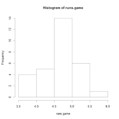
# you get a similar display by using a histogram

hist(runs.game)


# there are two teams who stand out with respect to runs scored

Team[runs.game>5.3]

[1] Texas Chicago Cubs

# what is the average number of runs per game scored by a team?

mean(runs.game)

[1] 4.621464

# do American League teams score more than National League teams?

mean(runs.game[League=="American"])

[1] 4.756021

mean(runs.game[League=="National"])

[1] 4.503728

# there is an interesting relationship between a team's winning
# proportion and the number of runs scored and runs allowed
#
# the relationship is log(W/L) = k log(RS/RA)
# where k is typically near 2

# we'll compute log(W/L), log(RS/RA)
# and fit a least-squares line -- we'll see if the slope is close to 2

log.WL=log(W/L)
log.RR=log(RS/RA)

lm(log.WL ~ log.RR)

Coefficients:
(Intercept) log.RR
-0.0003097 1.8377065

# here we see the slope is 1.84 which relatively close to 2

accessing Fathom

As a student that is a couple of hours removed from BGSU is there anyway I can install Fathom without coming to the campus?

Monday, August 25, 2008

Learning R

R is a great program but it has a relatively steep learning curve. To help you get started, I have three help sessions on R planned this week -- you need only attend one of the sessions.

I have four documents R_INTRO_PART_I, R_INTRO_PART_II, R_INTRO_PART_III, and R_INTRO_PART_IV in the Course Documents section that describe different aspects of R.

1. Manipulating vectors. A basic object in R is a vector. R_INTRO_PART_I discusses how to create and work on vectors.

2. Input and output. One typically wants to read datafiles into R -- read.table is useful for doing this. Data is typically stored in a R object called a data frame. Also you'll want to save R output including graphs and paste this material into a Word document.

3. Matrices. You should be comfortable working and manipulating matrices in R.

4. Plotting. You should be familiar with basic plotting commands and understand how one can add things (like labels and titles) to to graphs.

I hope you have R installed on your laptop. You may find it helpful to bring your laptop to the help session.

Friday, August 22, 2008

Installing R Packages

Now that you have successfully installed R, you have access to many functions in the R "base" package. But we'll want to add packages that will give us additional functions helpful for the class. I'll illustrate adding the package "aplpack" that we'll need to get the "stem.leaf" function. Also, I'll show you how to add the "LearnEDA" package that I wrote for the class.

Installing the package aplpack from CRAN.

1. In R, choose the menu item Packages -> Install Packages.

2. You'll be asked to choose a CRAN mirror site -- choose one in the United States.

3. Then you'll see a list of all available Packages -- choose aplpack.

4. At this point, the package will be downloaded and installed -- if you see the message

package 'aplpack' successfully unpacked and MD5 sums checked

you're in good shape.

5. The package aplpack is installed but not yet loaded into R. To load the package, you type

library(aplpack)

6. To check to see if you have the aplpack commands, try constructing a stemplot on a random sample of values from a standard normal distribution:

stem.leaf(rnorm(50))

If you get some display, you're set.

Installing the class package LearnEDA.

This is a package that I wrote that has some special functions and all the datasets we'll use. This is not available on CRAN yet, since it is still in development. But it is available from my website.

1. Go to the class web folder http://bayes.bgsu.edu/EDA/ and find the zip file

LearnEDA_1.0.zip

Download this file to the Windows desktop (or some other convenient place).

2. To install this package, select Packages -> Install Package(s) from local zip files

3. Select the LearnEDA_1.0.zip file. In a short time, R will install this package.

4. To see if you have successfully loaded this package, load in the package and check to see if you can read in one of the class datasets.

library(LearnEDA)
data(football)
football

If you see a lot of football scores, then you have succeeded in loading this package.

Installing R

Welcome to the EDA blog. I thought this would be a useful way of communicating and giving you advice that will help you succeed in this class.

My advice will apply to a Windows user which I think will apply to most to you. R also works fine on a Macintosh, but the precise instructions are a little different.

1. Go to The Comprehensive R Achieve Network at http://cran.r-project.org/

2. First choose a Mirror (click on Mirrors on the left) site somewhere in the United States -- this will shorten your download time.

3. Click on Windows in the Download and Install R section. Click on base and then click on the R-2.7.1-win32.exe link.

4. When this is downloaded on your machine, click on the R-2.7.1-win32.exe file. At this point, you'll just follow the instructions and the most recent version of R (2.7.1) will be installed.

5. To launch R, just double-click on the R icon on your desktop and you'll shortly see the following screen.