
When I was grading your homework this week, I thought of this story.
--------------------------------------------------------------------------
One day, a boy was interested in taking a course in exploratory data analysis, but he didn't have the money to pay for it. He decided on asking his grandmother for the money for the course. She decided to help, but she said "I hope this is a worthwhile class for you."
Anyway, the boy visited his grandmother recently and told her that the course was going well. The grandmother asked what he was learning and the boy responded:
Last week, we learned how to compare groups of data. We compared the yearly snowfall of Buffalo with Cairo. It was hard to compare the two groups since there was a dependence between level and spread that I learned by constructing a spread versus level graph. But this graph suggested the use of a p = 0.5 power transformation and when I did a spread versus level graph of the transformed data, the dependence between spread and level was reduced.
The grandmother, listening intently, responded "So what did you conclude from your data analysis?"
The boy said proudly "There is more snow in Buffalo than Cairo."
The grandmother then with a heavy sigh said "Can we get our money back?"
------------------------------------------------------------------------
What is the message in this story? (It relates to the work that you did on your homework.)
Tuesday, September 23, 2008

Wednesday, September 17, 2008
Boxplots in R
Here is a simple example of constructing boxplots and summary stats in R.
I'm interested in comparing the team statistics for baseball teams this year -- I've heard
that American League teams score more runs. Is that true?
Using data from baseball-reference.com, I created a dataset 2008teamstats.txt that contains current statistics for all 30 baseball teams.
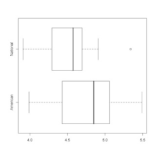
Here's my R script. I'll paste in a horizontal-style boxplot display at the end.
> b.data=read.table("http://bayes.bgsu.edu/eda/data/2008teamstats.txt",header=T)
> b.data[1:5,1:5]
Tm League R.G R G
1 TEX American 5.49 835 152
2 BOS American 5.29 799 151
3 MIN American 5.16 779 151
4 DET American 5.06 759 150
5 BAL American 5.03 750 149
> # I am interested in comparing the runs scored per game
> # (variable R.G) for the American and National league teams
>
> attach(b.data)
>
> # Here are the boxplots:
>
> boxplot(R.G~League)
>
> # boxplot has many options -- if you prefer horizontal style ...
>
> boxplot(R.G~League, horizontal=TRUE)
>
> # To get summary stats for each group, just assign boxplot()
> # to a variable, and then display the variable.
>
> b=boxplot(R.G~League, horizontal=TRUE)
>
> b
$stats
[,1] [,2]
[1,] 3.99 3.910
[2,] 4.43 4.295
[3,] 4.85 4.575
[4,] 5.06 4.695
[5,] 5.49 4.910
$n
[1] 14 16
$conf
[,1] [,2]
[1,] 4.583968 4.417
[2,] 5.116032 4.733
$out
[1] 5.34
$group
[1] 2
$names
[1] "American" "National"
I'm interested in comparing the team statistics for baseball teams this year -- I've heard
that American League teams score more runs. Is that true?
Using data from baseball-reference.com, I created a dataset 2008teamstats.txt that contains current statistics for all 30 baseball teams.
Here's my R script. I'll paste in a horizontal-style boxplot display at the end.
> b.data=read.table("http://bayes.bgsu.edu/eda/data/2008teamstats.txt",header=T)
> b.data[1:5,1:5]
Tm League R.G R G
1 TEX American 5.49 835 152
2 BOS American 5.29 799 151
3 MIN American 5.16 779 151
4 DET American 5.06 759 150
5 BAL American 5.03 750 149
> # I am interested in comparing the runs scored per game
> # (variable R.G) for the American and National league teams
>
> attach(b.data)
>
> # Here are the boxplots:
>
> boxplot(R.G~League)
>
> # boxplot has many options -- if you prefer horizontal style ...
>
> boxplot(R.G~League, horizontal=TRUE)
>
> # To get summary stats for each group, just assign boxplot()
> # to a variable, and then display the variable.
>
> b=boxplot(R.G~League, horizontal=TRUE)
>
> b
$stats
[,1] [,2]
[1,] 3.99 3.910
[2,] 4.43 4.295
[3,] 4.85 4.575
[4,] 5.06 4.695
[5,] 5.49 4.910
$n
[1] 14 16
$conf
[,1] [,2]
[1,] 4.583968 4.417
[2,] 5.116032 4.733
$out
[1] 5.34
$group
[1] 2
$names
[1] "American" "National"

Tuesday, September 16, 2008
Working with subgroups in R
Since we are comparing groups in EDA, I thought I would give some guidance on how to subset data in R.
Suppose we want to construct stemplots for the areas of the islands in each continent in the homework. Here is some R work for constructing a stemplot of the island areas in the Arctic Ocean. The key command is "subset".
By the way, I don't think there is a simple way of constructing parallel stemplots in R.
> data(island.areas)
> names(island.areas)
[1] "Ocean" "Name" "Area"
> attach(island.areas)
> arctic.areas=subset(Area,Ocean=="Arctic")
> arctic.areas
[1] 16671 195928 27038 6194 21331 75767 16274 12872 9570 15913 83896
[12] 8000 35000 2800 23940
> library(aplpack)
> stem.leaf(arctic.areas)
1 | 2: represents 12000
leaf unit: 1000
n: 15
1 0* | 2
4 0. | 689
5 1* | 2
(3) 1. | 566
7 2* | 13
5 2. | 7
3* |
4 3. | 5
HI: 75767 83896 195928
Sunday, September 14, 2008
Bins in a histogram and looking ahead
Hi EDA folks:
I finished grading your Fathom assignment on the number of bins. Generally, you all did well on this, but there are a couple of things I should mention.
1. The moral of this assignment is that as you have more data (bigger n), you should use a small bin width and have more bins. It seemed that your best histograms by eye were similar to the ones chosen by the "optimal rule" formula.
2. I think the rule wasn't that effective for constructing a histogram of the old faithful data. By using a small number of bins, you didn't see any structure in each of the two humps.
3. If you lost points, it probably was due to some confusion on your calculations or maybe not the best answer to a question -- like the one about the histogram of the old faithful data. If you don't know why you lost points, just email me .
Looking ahead, the next assignment is on EFFECTIVE COMPARISON. You'll learn a specific method for equalizing spreads between batches. Although you might understand the method (spread vs. level plot, reexpressing, etc), it is important not to lose sight of what we are trying to accomplish. We want to make a reasonable comparison between groups.
So, when you do your homework this week, don't forget to think about the BIG PICTURE. Conclude your work by making a comparison.
Last, we'll be using some new R commands. Don't forget to look at the "Chapter 3 work" file that illustrates the use of these new commands.
Sunday, September 7, 2008
EDA Grading
Most of you are doing great on the homework so far. But I thought I should explain how I great and why you may be losing points.
Generally I am more interested in your explanations and how you are answering the main questions of interest. For example, in the graphs and summaries homework, I am not interested as much in your R work and your computation. Most of you are doing ok in getting R to produce stemplots and compute letter values. But the BIG questions are ...
-- what is the best choice of stemplot?
-- what have we learned about the data in terms of shape, average, and spread?
-- are there observations that deviate from the rest and why are these observations unusual?
You should be addressing these BIG questions in the first R homework.
In the Fathom activity, we were looking at the number of outliers one would expect for samples from different population distributions.
For normal data, we don't see many outliers. But if the data comes from a flat-tailed distribution (like the t distribution), outliers are more common. If this general conclusion wasn't obvious from your work, then you may have lost points.
Here is a final quibble (small point). Most of the stemplots you showed me were hard to read and certainly you wouldn't want to use them for any presentation.
Which stemplot do you prefer?
Stemplot A:
1 | 2: represents 1.2
leaf unit: 0.1
n: 50
2 -1. | 55
6 -1* | 0233
11 -0. | 67899
22 -0* | 01111113344
(9) 0* | 112223334
19 0. | 789999
13 1* | 0011233
6 1. | 68
4 2* | 023
1 2. | 9
Stemplot B:
1 | 2: represents 1.2
leaf unit: 0.1
n: 50
2 -1. | 55
6 -1* | 0233
11 -0. | 67899
22 -0* | 01111113344
(9) 0* | 112223334
19 0. | 789999
13 1* | 0011233
6 1. | 68
4 2* | 023
1 2. | 9
The message here is that you should use a monoproportional font where each character takes the same space like Courier.
Saturday, September 6, 2008
Using the LearnEDA package
I'm starting to grade your first R homework. I wrote the LearnEDA package to make it easier for you to read in datasets and do some basic calculations.
If you look at the R folder in the Course Documents section of Blackboard, you'll see the appropriate R commands for each topic.
FOR EACH HOMEWORK, MAKE SURE YOU LOOK AT THE R FOLDER SO YOU KNOW
THE COMMANDS YOU NEED TO USE.
In the first homework, you were supposed to read in the baseball attendance data and compute some letter values.
Here's how you do this in R using the LearnEDA package. (I'm assuming you have already installed this package.)
This loads the package.
> library(LearnEDA)
Read in the dataset:
> data(baseball.attendance)
Attach the data to make the variable names available:
> attach(baseball.attendance)
Compute letter values:
> lval(Home.Attendance)
depth lo hi mids spreads
1 15.5 32783.5 32783.5 32783.50 0.0
2 8.0 23704.0 36164.0 29934.00 12460.0
3 4.5 21614.5 40166.0 30890.25 18551.5
4 2.5 16574.0 41010.0 28792.00 24436.0
5 1.0 8651.0 42067.0 25359.00 33416.0
>
Thursday, September 4, 2008
Some common problems in R and Fathom
Here are some common questions I've heard recently about R and Fathom.
1. Some of you are having problems reading in datafiles which is a big concern. There are two ways you can mess up.
(a) First, it is important that R can find your files. Put all of your R work in a particular folder, say EDA, and then by choosing menu item File -> Change dir ..., you select the file EDA. To check if the working directory really has changed, type
dir()
and you should see your data files.
(b) A general form to read in a text datafile is
data=read.table(file.name, header=T, sep="\t")
where file.name is in double-quotes. The header option says that the first line in the file contains the variable names and the sep option says that columns are separated by the tab character.
2. How do you plot curves on Fathom?
Suppose you have created a scatterplot and wish to add a curve. You select the graph and choose the menu item Graph -> Plot Function. Then you just type the function (using the variable name on the x axis) in the box.
Subscribe to:
Posts (Atom)